Sexism. It's never cool.
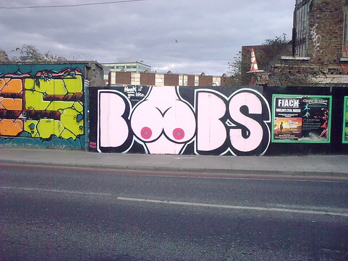
About a week ago I was unimpressed by this “streetart” on a wall of the Bernard Shaw pub in Portobello:

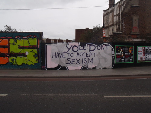
Very unimpressed. It's just sexist. And boring. And not even very well done. To ram home the message, the text in the top left corner reads 'honk if you like'. But happily today I saw that someone had critiqued it very effectively:

Really encouraging – good to see that I wasn't the only one who found this objectionable, and great to see someone taking action, and using the same medium to do it. A suitable response executed in an appropriate way, in graffiti terms, that will reach the same audience.
I was originally disappointed not only because of the nature of the piece, but because I like the Bernard Shaw, it's run by a group of young(ish) folks who do a lot of music and art, including the Bodytonic music nights, and who provide space in the bar to exhibitions of interesting local artists. They're also big supporters of graffiti and street art, the wooden hoarding on both sides of the pub building are covered with frequently changing pieces, sometimes painted ads, but more often large pieces by individual writers or groups. In fact I've a large collection of photos of some great pieces on these walls, that I'll one day get around to posting, and also some before-and-after shots. I guess the photos above would fit in either collection. The pub's smoking area is also entirely decorated with graffiti and the carpark in a large yard round the back has its walls covered with some excellent pieces. So it was particularly disheartening to see this piece of sexism on their walls, effectively endorsed by them, and that such a place would think this was acceptable or even funny.
I'd also struggled with whether I should post the first photo, because while I wanted to criticise it, I didn't want to just draw attention to it. Now, in context with the second pic, I feel like viewers won't be as easily able to use it to bolster their own sexism.
Unkie Dave, to whom credit goes for first spotting the update, and I wondered if the whole thing might be a deliberately provocative awareness-raising effort – first the boobs pic to draw people in, letting them gauge their own reaction, then the effacing of it with a positive and challenging counter-message. But from the style, words, and handwriting of the second 'edit' it doesn't look to me like this response was part of the original intent. Instead it seems like the original writers and the Bernard Shaw, which presumably commissioned them or at least approved their use of the wall space, simply thought that bog-standard sexism was amusing or acceptable. How sad.
A couple more photos here:
lusciousblopster - Don't Accept Sexism - set on flickr

Very unimpressed. It's just sexist. And boring. And not even very well done. To ram home the message, the text in the top left corner reads 'honk if you like'. But happily today I saw that someone had critiqued it very effectively:

Really encouraging – good to see that I wasn't the only one who found this objectionable, and great to see someone taking action, and using the same medium to do it. A suitable response executed in an appropriate way, in graffiti terms, that will reach the same audience.
I was originally disappointed not only because of the nature of the piece, but because I like the Bernard Shaw, it's run by a group of young(ish) folks who do a lot of music and art, including the Bodytonic music nights, and who provide space in the bar to exhibitions of interesting local artists. They're also big supporters of graffiti and street art, the wooden hoarding on both sides of the pub building are covered with frequently changing pieces, sometimes painted ads, but more often large pieces by individual writers or groups. In fact I've a large collection of photos of some great pieces on these walls, that I'll one day get around to posting, and also some before-and-after shots. I guess the photos above would fit in either collection. The pub's smoking area is also entirely decorated with graffiti and the carpark in a large yard round the back has its walls covered with some excellent pieces. So it was particularly disheartening to see this piece of sexism on their walls, effectively endorsed by them, and that such a place would think this was acceptable or even funny.
I'd also struggled with whether I should post the first photo, because while I wanted to criticise it, I didn't want to just draw attention to it. Now, in context with the second pic, I feel like viewers won't be as easily able to use it to bolster their own sexism.
Unkie Dave, to whom credit goes for first spotting the update, and I wondered if the whole thing might be a deliberately provocative awareness-raising effort – first the boobs pic to draw people in, letting them gauge their own reaction, then the effacing of it with a positive and challenging counter-message. But from the style, words, and handwriting of the second 'edit' it doesn't look to me like this response was part of the original intent. Instead it seems like the original writers and the Bernard Shaw, which presumably commissioned them or at least approved their use of the wall space, simply thought that bog-standard sexism was amusing or acceptable. How sad.
A couple more photos here:
lusciousblopster - Don't Accept Sexism - set on flickr
Labels: graffiti
1 Comments:
I agree with you, the piece was sexist and the way it was countered was completely appropriate, Write back to graffiti you dont like/agree with, thats the idea of it, express your opinion.
As far as saying it wasnt well done, hmmm its a nice Style and there is can control and nice letter forms.. but thats jus my graff artist point of view...
Cool post anyways
Post a Comment
<< Home